Device Flexibility
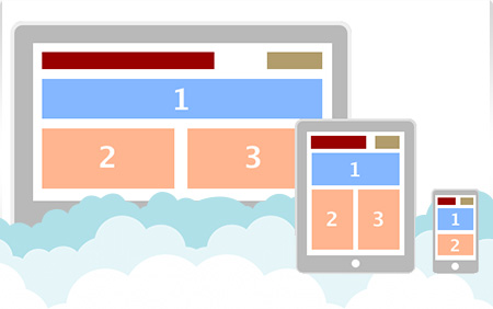
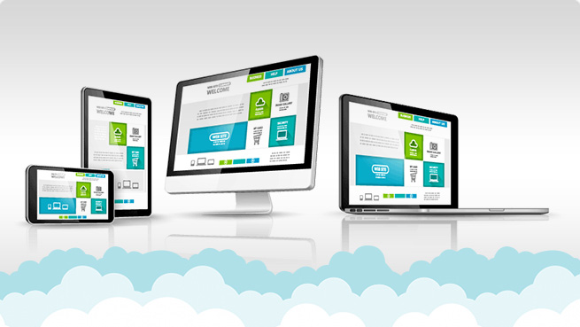
Responsive websites should transform itself to fit various devices and screen sizes. Website elements should wrap and resize gracefully when transitioning from desktop, tablets and mobile devices.

User Experience
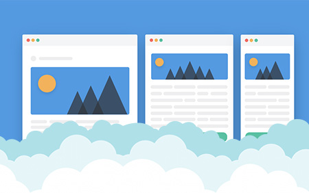
Responsive design allows content to stack on top of one another creating a simple way for viewers to scroll through content. Using responsive design eliminates horizontal scrolling giving users a smoother experience when scanning content on your website.

Less Maintenance
In the past, multiple versions of website elements were used to display both desktop and mobile content. Responsive design allows you to manage a single version of content that wraps and resizes itself based on the device or screen size you're viewing it in.
Statistics
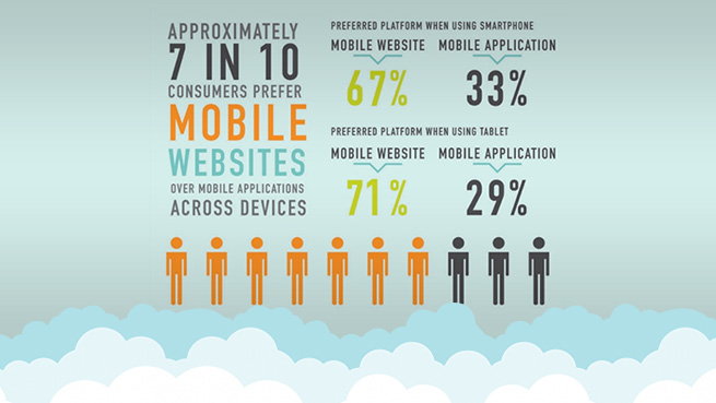
Studies show that 79% of online users will be viewing web pages from a mobile device by the end of 2018. It's important that your website evolves to the new digital landscape. Responsive design improves visitors experience when viewing your website.
